After a long season of whiteness, cold, and introspection, it’s finally time to go out, breathe fresh air, open the windows, feel the sun, and hear the birds and nature blooming.
So poetic, right? But that’s exactly the feeling.
And all this joy gets to be reflected in our home and at our table — through colour, through objects that bring freshness and life back into our everyday moments. Whether you’re refreshing a corner of your living room or styling your spring tablescape, colour is the easiest and most joyful place to start.
In this post, I’m sharing the five spring colours I chose for my home and table this season — timeless enough to last, fresh enough to feel new — plus the home and hosting trends I’m most excited about right now, and a collection I completely fell in love with.
Let’s bring spring in. 🌿
Table of Contents
Start Here — The Simplest Spring Refresh
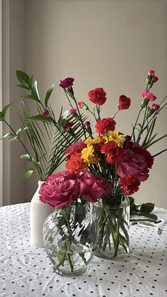
Before we talk about colours and trends, there is one thing that instantly brings a spring feeling into your home and onto your table.
A vase filled with fresh flowers.
That’s it. Start here.
I’ve done mine, and every time I walk past it, something in me exhales. It costs almost nothing and changes everything. If you do nothing else from this post, do that.
Spring Colour Trends for Home Decor and Tablescape
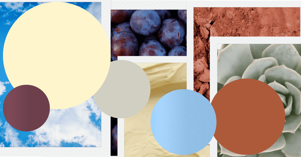
I chose five colours for this season. Each one is trending right now, but more importantly, each one is timeless enough to work beyond this season and versatile enough to mix and match with each other.
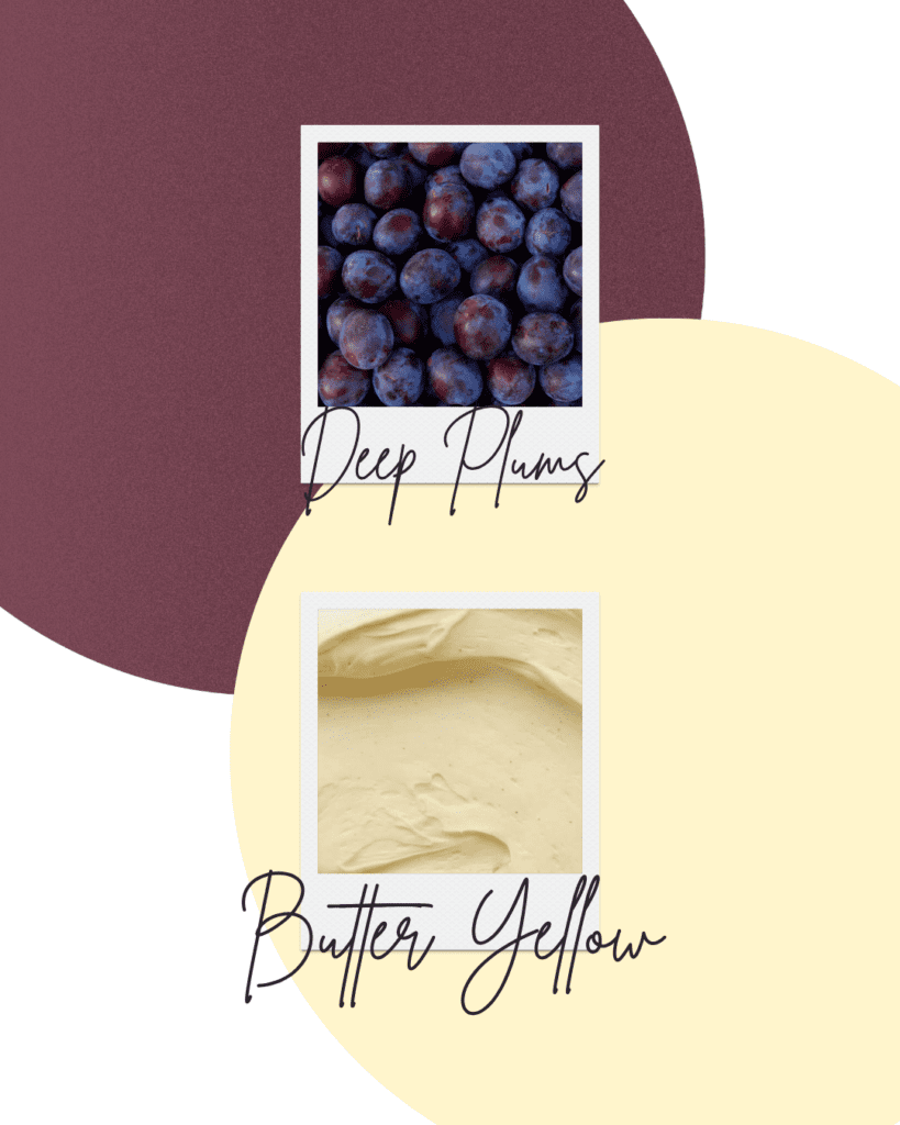
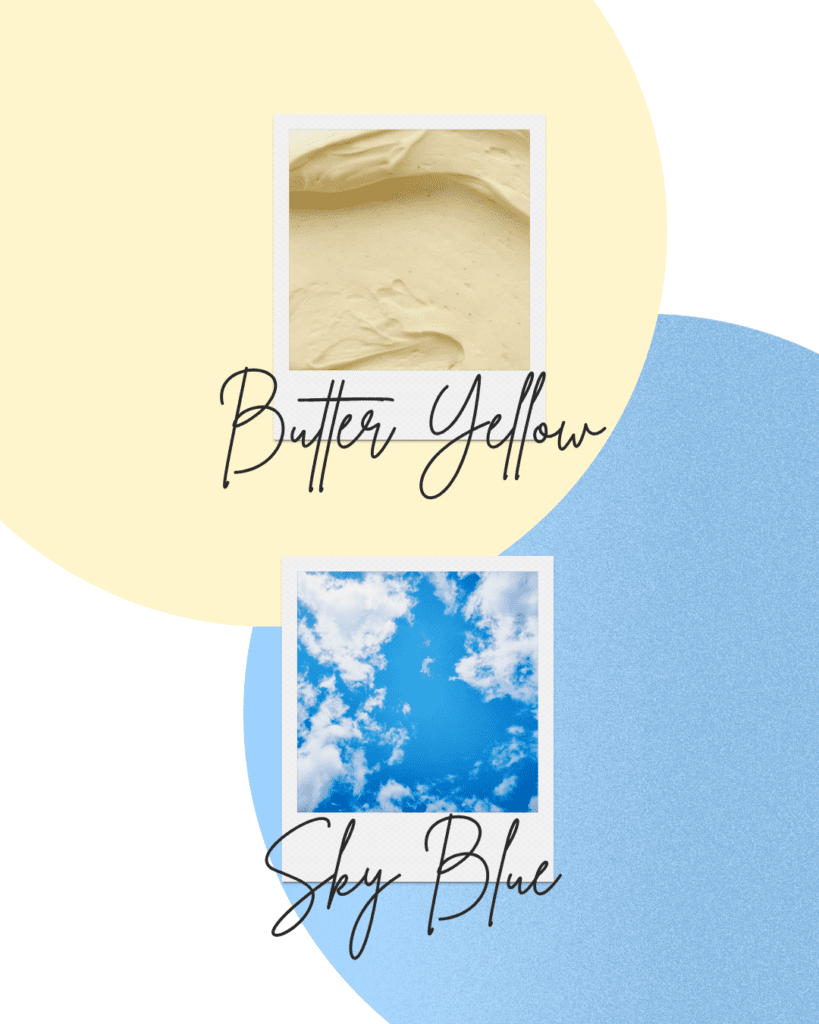
1. Butter Yellow
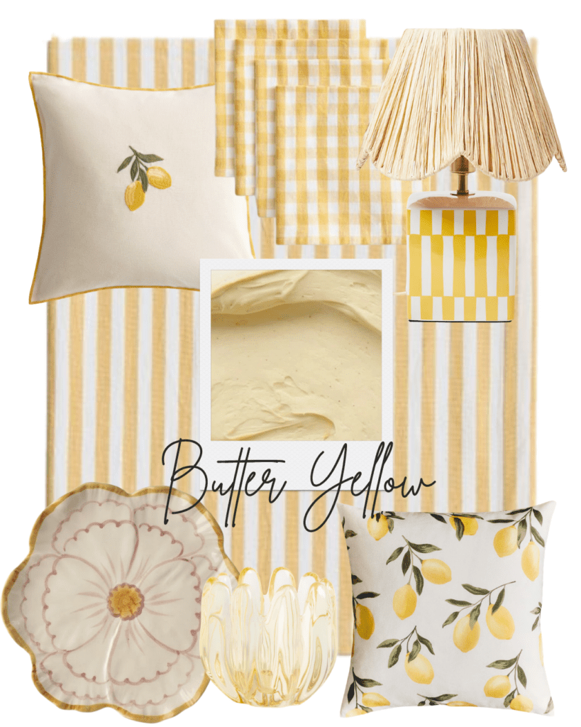
Butter yellow is the happiest colour of spring — soft, warm, and full of sunshine. It’s the colour everyone is talking about right now, and for good reason. It manages to feel both cheerful and sophisticated, which is rare.
For your home: lemon-embroidered cushions, and a cheerful lamp to brighten any corner of your living room or entrance.
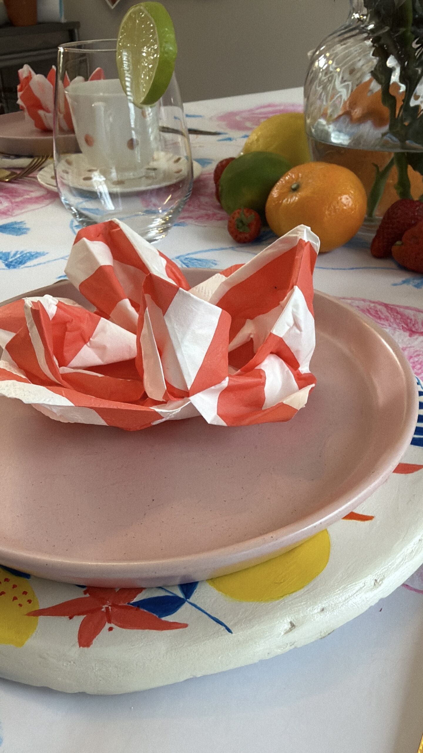
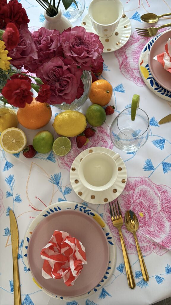
For your tablescape: A striped tablecloth layered with a checkered napkin is the easiest way to bring butter yellow to your table right now — playful, patterned, and completely on trend. Added to a beautiful Cookware with an embossed petal design on the lid for serving at the table.
Every ordinary day deserves a little sunshine. ✨
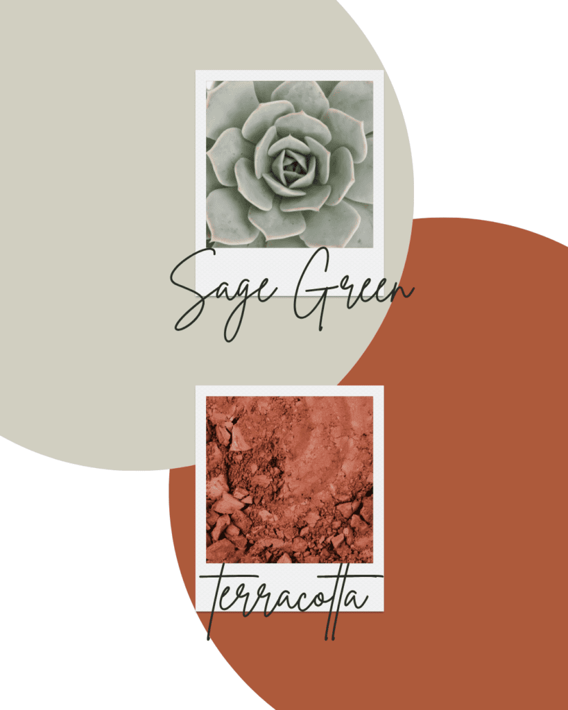
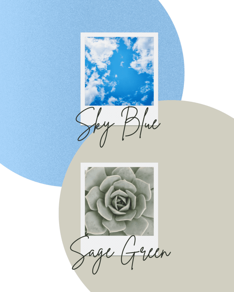
2. Sage Green
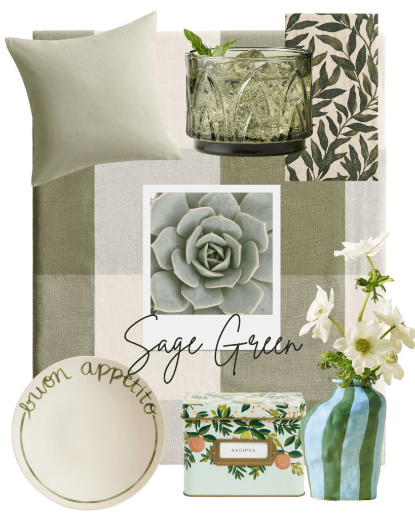
Sage green is one of the most searched home decor colour trends for spring, and it’s easy to understand why. This soft, natural palette works beautifully in any room and at any table.
It feels calm, grounded, and alive all at once.
For your home: Linen cushions, botanical wallpaper, and ceramic vases in bright tones.
For your tablescape: Sage green glassware paired with a gingham Linen-Blend Tablecloth, a botanical napkin, and a dinner plate with green details — simple, intentional, and deeply cozy. It pairs beautifully with terracotta and sky blue.
A home that feels calm, intentional and alive. 🌿
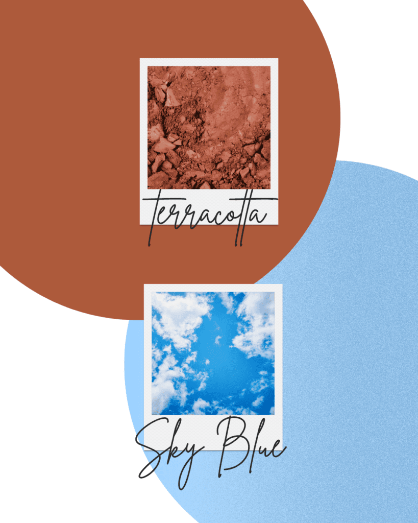
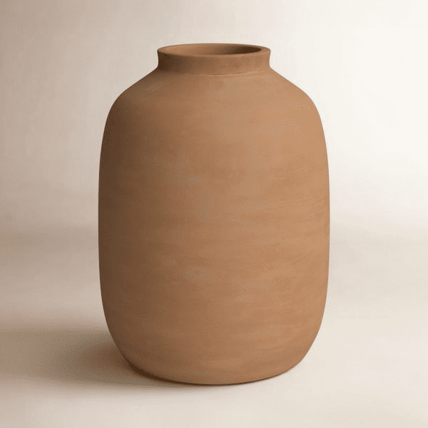
3. Terracotta
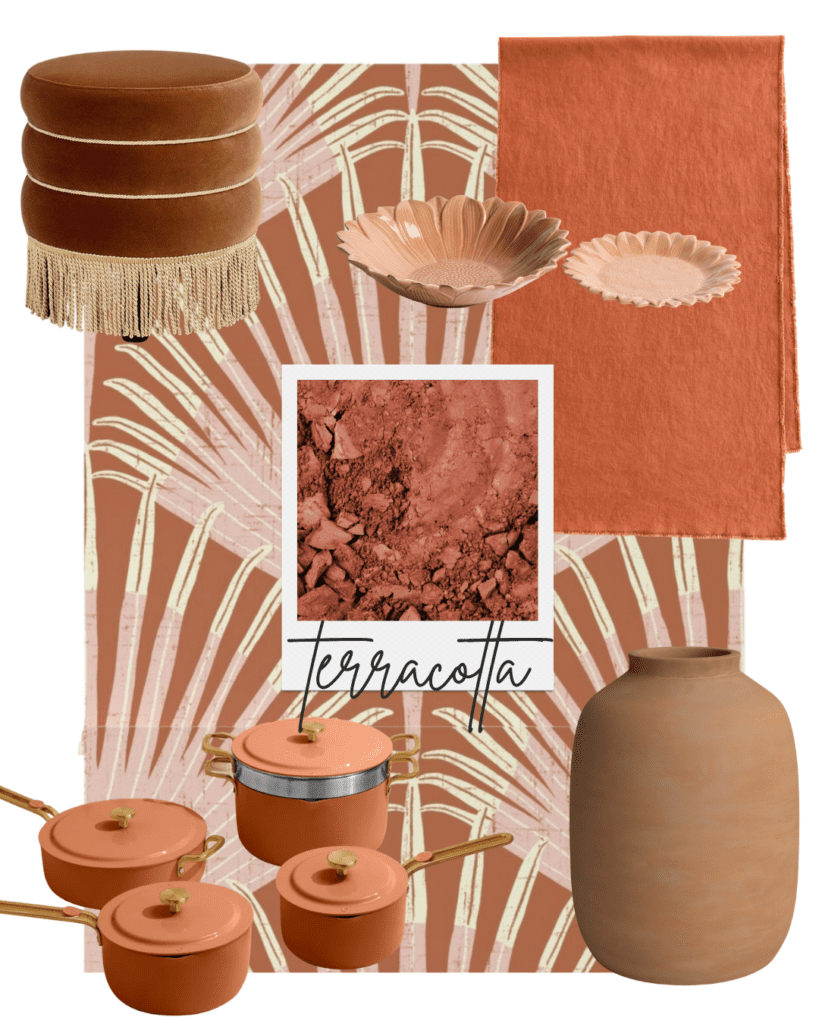
Terracotta is one of the warmest and most timeless home decor colour trends for spring. It never really goes out of style. It just gets rediscovered every spring and autumn, and each time it feels right.
For your home: Cookware in earthy tones suitable for serving at the table, earthy patterned wallpaper, clay vases, and a velvet ottoman that adds depth and warmth to any space.
For your tablescape: Terracotta flower-shaped dishes paired with a warm linen table runner and a simple centrepiece of dried or fresh botanicals.
*This colour is stunning layered with sage green or sky blue, creating a palette that feels both earthy and fresh.
I personally love this colour. It grounds a space without weighing it down. 🧡
4. Sky Blue
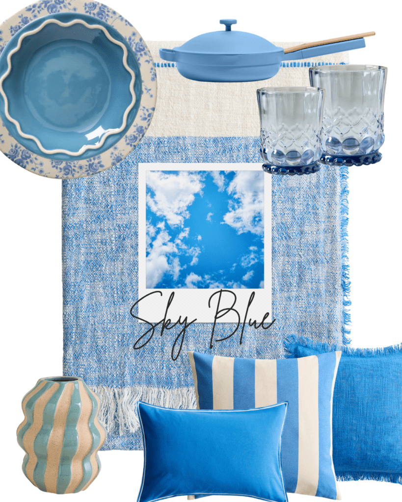
Sky blue is one of the freshest colour trends for spring, and it works beautifully in the kitchen, the dining room, and at the table. It brings light and calm into any home, like opening a window on a perfect spring morning.
For your home: a throw blanket with a fringe detail, cushions in various sizes and patterns, and the most beautiful blue cookware as a statement piece on your stove or table.
For your tablescape: Sky blue dinnerware paired with Blue floral dinnerware on a neutral linen runner, and blue drinkware and simple white flowers — clean, airy, and effortlessly beautiful.
*Layer it with butter yellow napkins for a combination that feels joyful and unexpected.
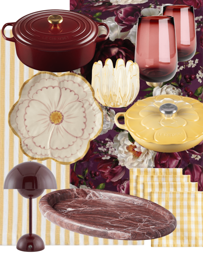
5. Deep Plum
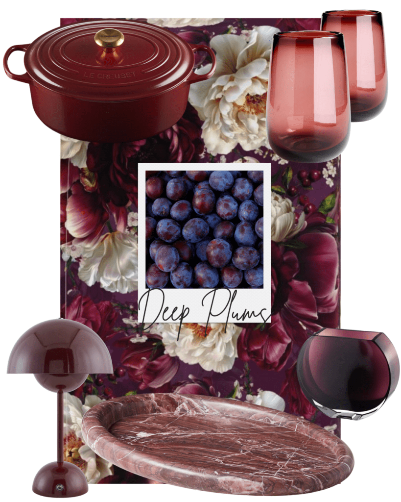
Deep plum is the colour that surprises people most on this list, but it belongs here.
Spring is going rich and layered as well as light and airy, and deep plum is the most luxurious expression of that.
For your home: Rich cookware, tinted glassware, marble trays, and a statement table lamp that makes every corner feel intentional and beautiful.
For your tablescape: Deep plum drinkware against a floral-patterned tablecloth— moody, elegant, and completely unexpected for spring.
Pair it with dried botanicals and candlelight for an evening table that feels genuinely special.
How to Mix These Colours
One of the questions I get most is: Can I use more than one colour at a time, and how?
The answer is yes — and it’s easier than you think. These five colours were chosen specifically because they work together. Here are five combinations I love:
Warm & Earthy
Sage Green + Terracotta
Grounded, warm, and full of life. Perfect for a cozy Living Room or Bedroom decor.
Fresh & Airy
Sky Blue + Sage Green
Light, calm, and effortlessly elegant. Beautiful for an outdoor or al fresco setting or a spring brunch table.
Earthy & Fresh
Terracotta + Sky Blue
These colours are opposite in feeling, which is why they pair so well.
One is grounded and warm, and the other is airy, fresh, and calm. Perfect for a lunch tablescape or Entrance decor.
Bold & Unexpected
Deep Plum + Butter Yellow
Rich and joyful at the same time. Perfect for a dinner table.
Joy & Refreshing
Butter Yellow + Sky Blue
Opposite colours that work beautifully together, bringing freshness and joy to the space.
Perfect for a brunch or lunch tablescape.
Valuable Tip: The key is always to anchor the combination with a touch of neutrals — Oat, linen, cream, warm white. So the colours sing without competing. 🌿
Spring Home & Hosting Trends I’m Excited About
Colour is just one part of the story. Here are the four trends I’m seeing everywhere right now, and loving:
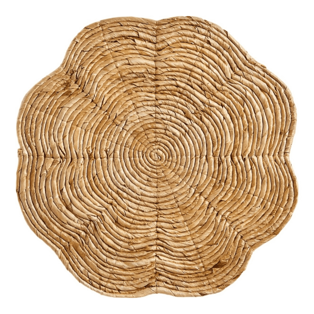
1. Natural Textures
Raw, pure materials are having a real moment — linen, wood, rattan, clay.
Used in placemats, charger plates, rugs, and table runners, these textures bring warmth and grounding to any space or table.
They also make handmade and artisanal objects feel even more at home, human, which leads perfectly to the next trend.
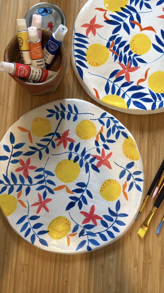
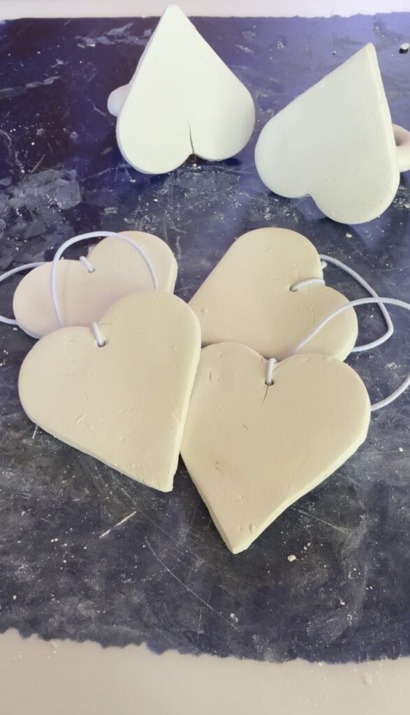
2. Artisanal & Handmade Objects
People are valuing craftsmanship more than ever. A handmade mug, a ceramic bowl with an imperfect edge, a plate that clearly came from someone’s hands.
These objects carry meaning in a way that mass-produced pieces simply don’t.
It’s a trend that feels less like a trend and more like a return to something true. If you have a handmade piece you’ve been saving for special occasions — bring it out. Use it now.
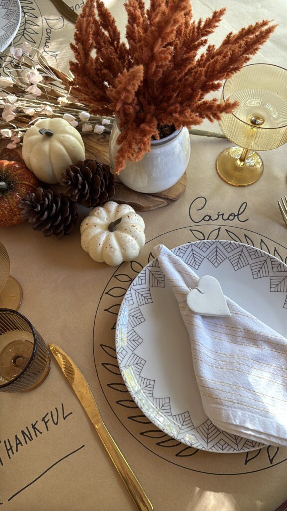
3. Heritage & Heirloom Accents
Tablescapes are increasingly featuring antique frames, vintage-inspired patterns, and objects that evoke a sense of history — the “collected over time” aesthetic.
This is one of my favourite trends because it’s also the most personal. Pull out your grandmother’s teacups, that one vintage plate you found at a flea market, the linen napkins that belonged to someone you love.
Mix them with modern, minimal pieces — metallic accents, clean-lined glassware — and suddenly your table tells a story. Eclectic, meaningful, and completely yours.
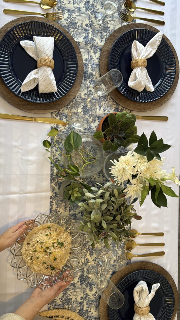
4. Pattern Layering — Pattern Drenching
Designers are encouraging bold pattern combinations this season — stripes layered with florals, different tartan patterns mixed together, and gingham alongside botanical prints.
And because the heritage trend is so strong right now, this makes perfect sense. You might only have one or two pieces from a vintage set — one teacup, one dinner plate, one dessert plate. Use them all together on a floral tablecloth. It’s completely on trend, deeply personal, and far more interesting than a perfectly matched set. 🌿
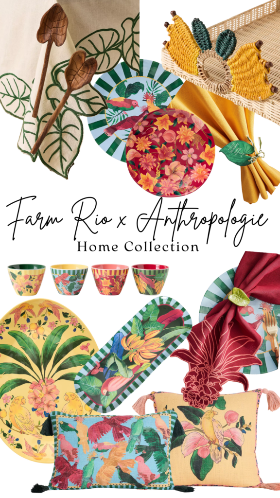
A Collection I Fell in Love With — Farm Rio x Anthropologie
I have to tell you about this collection because when I discovered it, I genuinely got excited.
Farm Rio (a Brazilian brand and yes, my original country 🇧🇷) created an exclusive home collection with Anthropologie. And it is everything spring and summer should feel like.
Colourful, joyful, alive. With the most beautiful use of yellow, red, blue and green. It feels like someone bottled the energy of a Brazilian summer and translated it into home objects.
I curated my favourite pieces for you. They’re all waiting in my ShopMy store
Bringing It All Together
This season, we’re not just decorating. We’re choosing objects with meaning, with history, with a little bit of who we are in them.
A handmade charger plate. Your grandmother’s teacup. A colour that makes you smile every morning. A table set not for a special occasion, but because today is enough of a reason.
After all:
Let’s normalize ordinary special days.
✨I’d love to know which colour or trend you’re bringing into your home this spring. Tell me in the comments.
And if you want more of this seasonal inspiration, curated finds, and a little slow living philosophy delivered once a month, come find me in the Mindful Letter. It’s free, it’s warm, and it always arrives with love.
→ Join the Mindful Letter here
With love, Carol 🌿
Proudly powered by WordPress

Leave a Reply